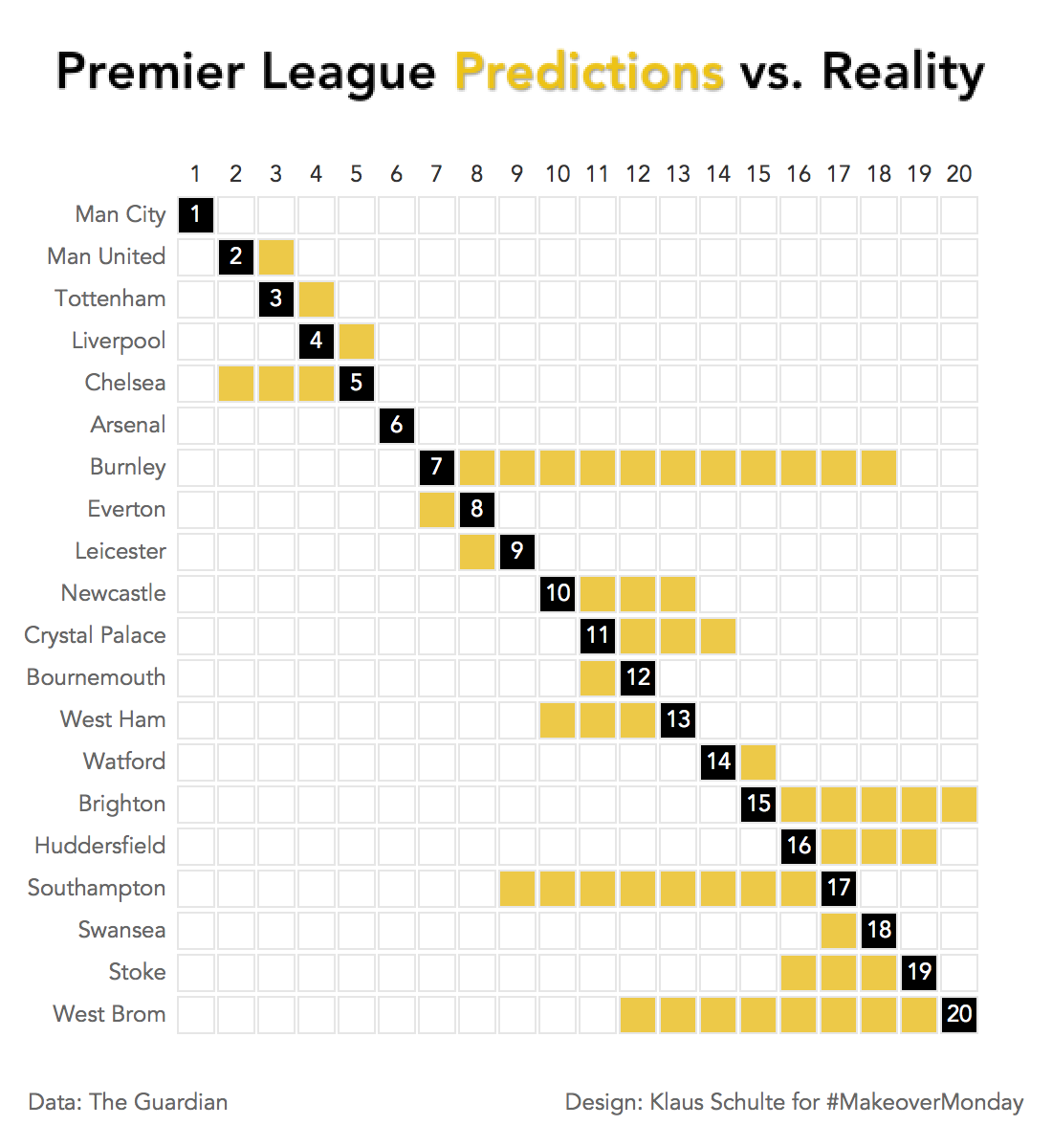
For this week's #MakeoverMonday I created a visualization to compare Premier League pre season predictions with reality after 38 rounds:
I was inspired by an article in our local newspaper some weeks ago where possible changes at the last matchday in German Bundesliga were visualized this way:
I like this viz by muensterlandzeitung. pic.twitter.com/kl77cQscLD
— Klaus Schulte (@ProfDrKSchulte) 10. Mai 2018
I recreated the basic idea of this viz by using a waffle chart.
If you want to recreate my viz it just needs the following few steps.
1. Create a waffle
To build the waffle I created this data in Excel combining twenty rows ("Zeile") with twenty columns ("Spalte") to get the 400 cells of my matrix.
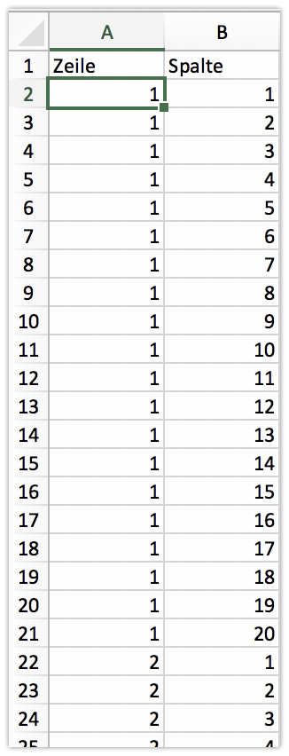
Bringing in "Zeile" on rows and "Spalte" on columns, selecting square in the marks card and a little bit of sizing the squares creates this waffle in Tableau.
![Tableau - Premier League Predictions vs. Reality [von PUBLIC.TABLEAU.COM] 2018-05-20 17-25-06](../images/wp-content__uploads__2018__05__tableau-premier-league-predictions-vs-reality-von-public-tableau-com-2018-05-20-17-25-06.jpg)
2. Linking waffle and data
After linking my two data sources on "Zeile" and "Actual Finish" I was able to bring in the teams on rows.
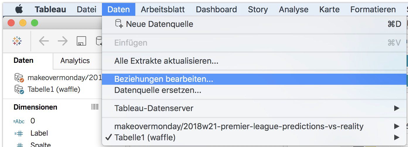
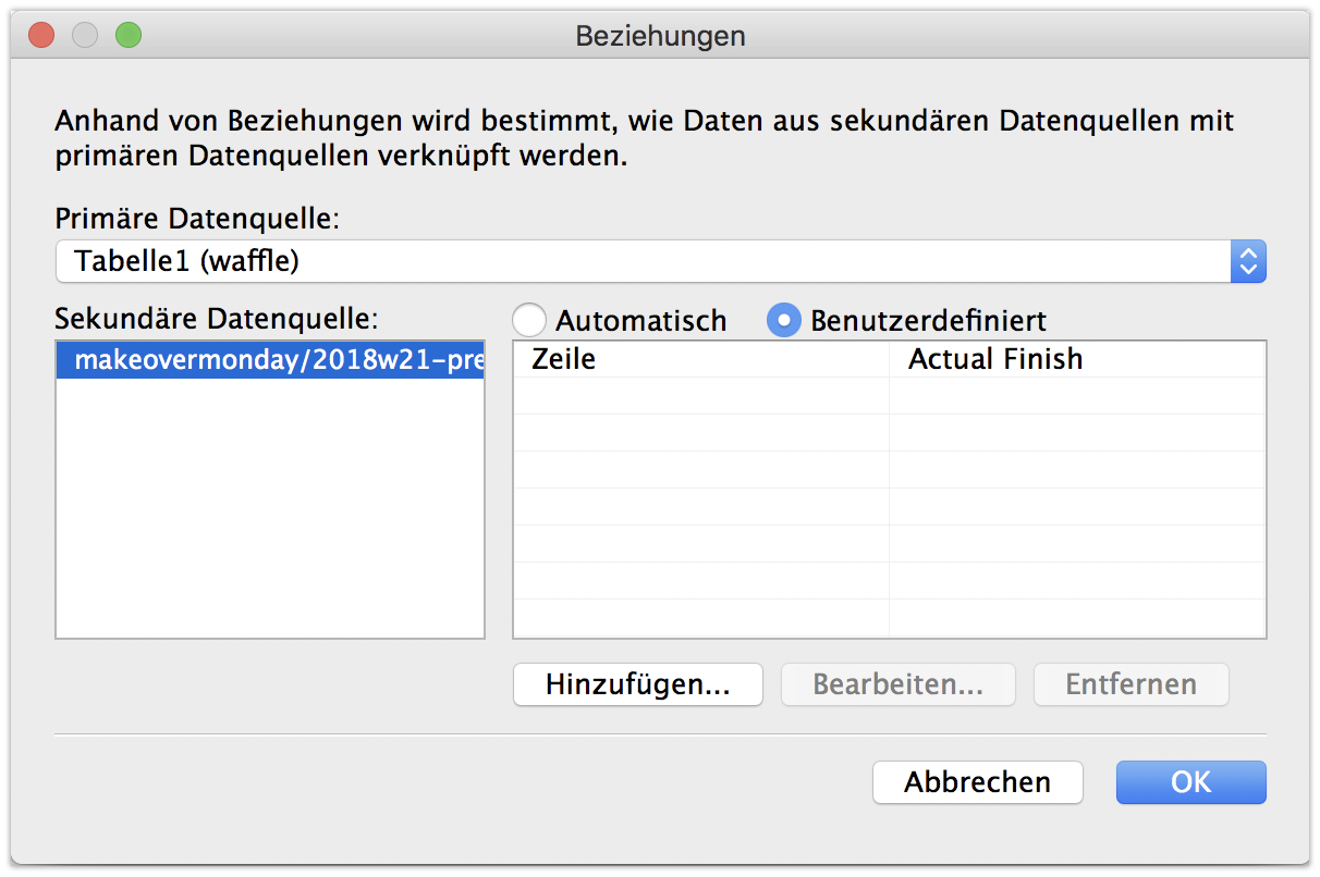
![Tableau - Premier League Predictions vs. Reality [von PUBLIC.TABLEAU.COM] 2018-05-20 17-30-00](../images/wp-content__uploads__2018__05__tableau-premier-league-predictions-vs-reality-von-public-tableau-com-2018-05-20-17-30-00.jpg)
3. Coloring the waffle
To color the waffle it just needs two boolean calculations:
a) [Spalte]=[Zeile] for the actual finish (the diagonal) and
b) The difference between actual and predicted finish
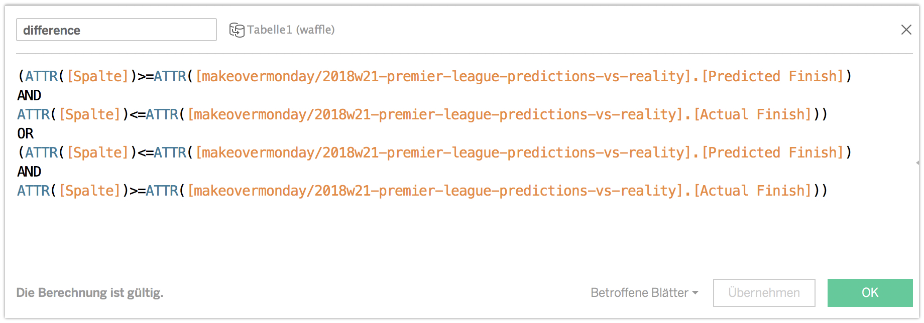
![Tableau - Premier League Predictions vs. Reality [von PUBLIC.TABLEAU.COM] 2018-05-20 17-42-23.jpg](../images/wp-content__uploads__2018__05__tableau-premier-league-predictions-vs-reality-von-public-tableau-com-2018-05-20-17-42-23.jpg)
The rest is just a little bit of formatting.
Et voilá: