When I was reading a news website earlier today I had this nice user experience when I was hovering this chart:
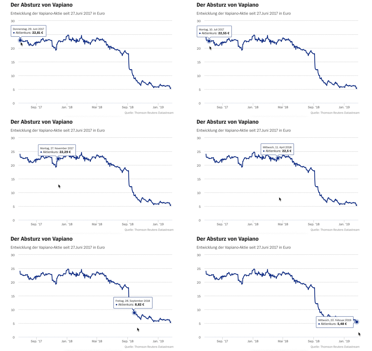
I really like that you don't have to follow the line chart to get the tooltip. Especially when you have a very thin line it can be hard in Tableau to hit the line to get the tooltip.
So, how can this be done in Tableau? I experimented a little bit with set actions, but the performance wasn't good enough to come even close to the performance of my model. So, I finally ended up with this:
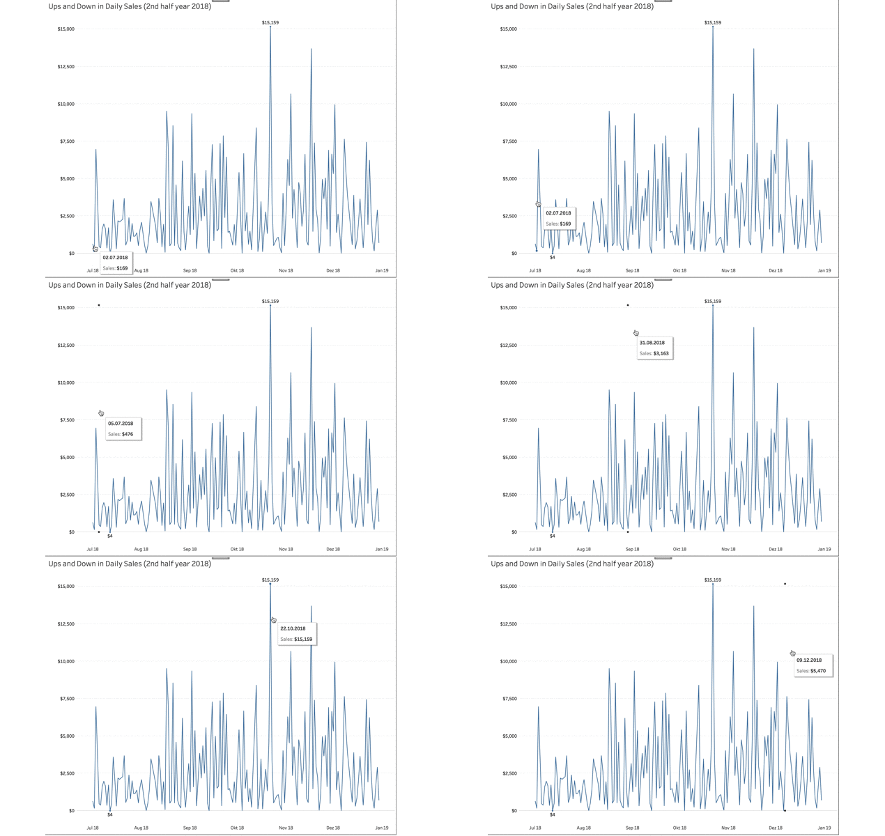
This technique has the same performance, however I had to get rid of the dot highlighting the corresponding value on the line chart. But nevertheless I think it can be useful in some limited use cases (having only one line and a free second axis).
How can it be done? Very easily:
- Create a line chart (again: with only one line!)
- Calculate the maximum value of the measure for each point. You can do this by using an LOD-expression or a table calc.
I used this LOD-expression:
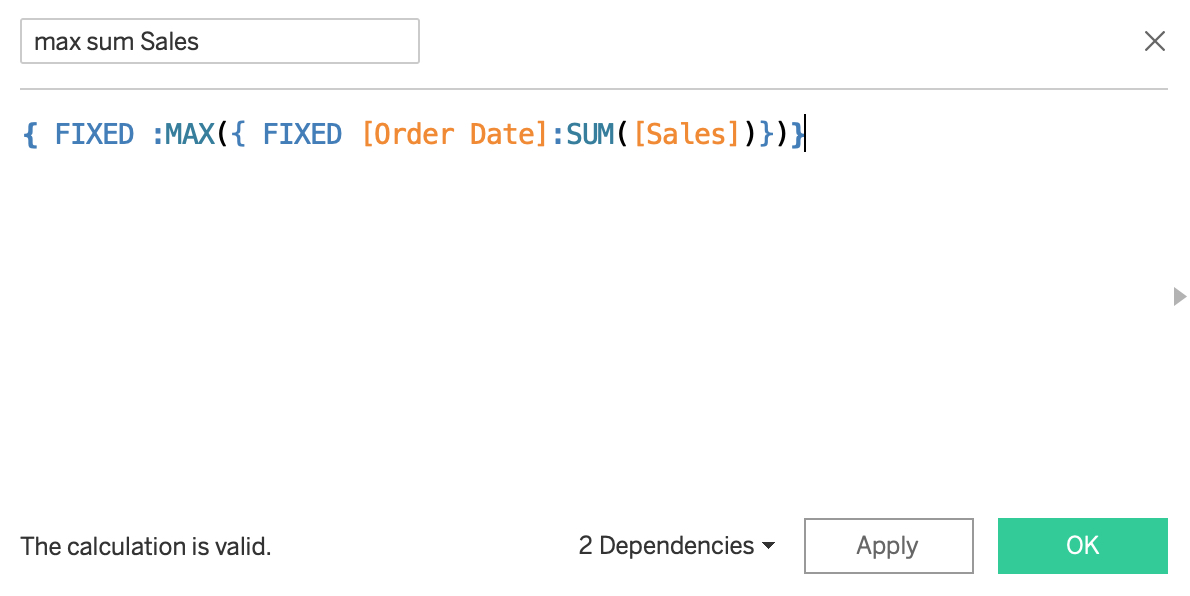
- Bring this measure to the first axis (and your original measure to the second), create a dual axis and synchronize axes.
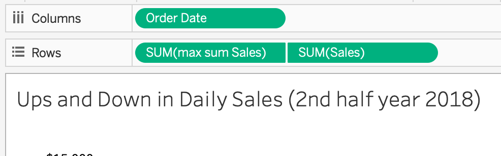
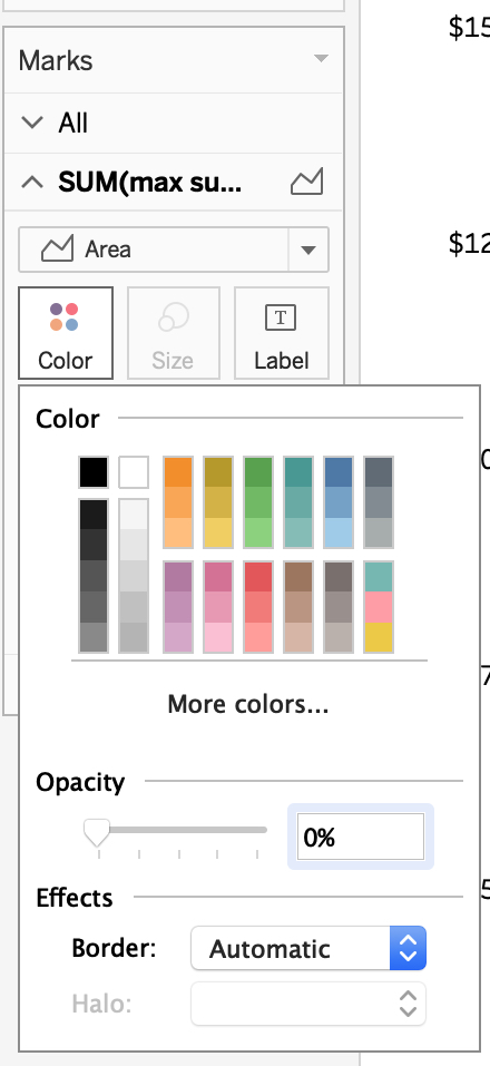
- Select area from the marks card and set opacity to 0.
- Match the tooltips for both axes.
That's it!