Step line charts have been introduced with Tableau's 2018.1 release and it's really hard to remember that there was a time before, where it needed a little hack to create such a step line, like for example described in this post by Rody Zakovich.
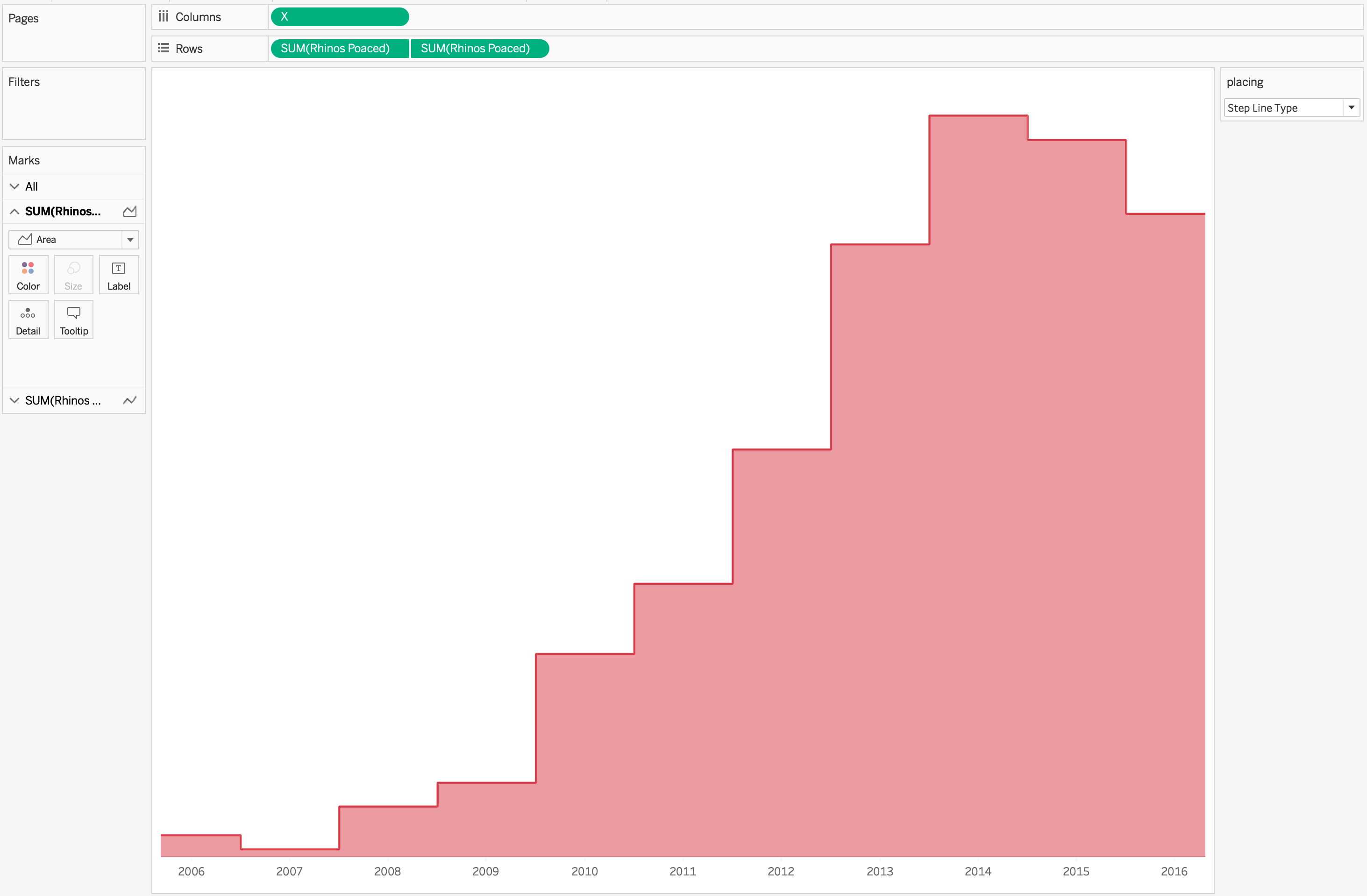
When I was working on this week's #makeovermonday dataset I had the idea of creating a step area chart. Unfortunately the options to create a step area chart the same way like step line charts aren't available for the area mark:
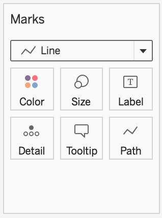
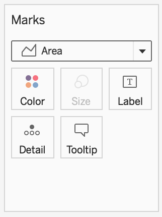
We don't have a path-card to choose the step line type or to create a step line using the index-function like described in Rody's post.
So, what to do?
1. Data Prep
The only way left to create a step line needs some data prep first. I doubled the data when I queried it from data.world (I eventually even tripled the data to get more flexibility for the labels of my step area chart):
SELECT
1 as copy
, year
, rhinos_poaced

from rhino_poaching

union ALL

SELECT
2 as copy
, year
, rhinos_poaced

from rhino_poaching
2. My X-Axis
Second step is to calculate my x-axis using the copy and year fields and a parameter.
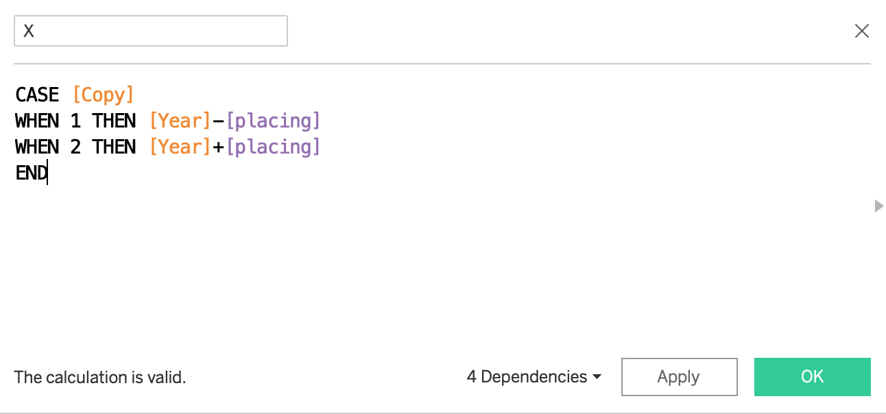
For the linear line type I set the placing parameter to zero:

This size() function is showing that there 11 marks, one for every year in the data. Like it should be.
To create a step line, we need two points for every year. When I change the parameter to 0.3 (or "a little bit stepish" in my workbook) you get 22 marks, two for every year in the data. This is what we need.

For the perfect step line my first impulse was to set the parameter to 0.5. But look what happens:

We only get 12 marks on our axis. Because we get the same values for the years +0.5 and the next year -0.5 (e. g. 2006+0.5=2007-0.5). That doesn't work.
3. The Solution
The solution is to set the parameter very close to 0.5, I therefore chose a value of 0.499999.
![Edit Parameter [placing] 2019-05-14 22-43-58.jpg](../images/wp-content__uploads__2019__05__Edit-Parameter-placing-2019-05-14-22-43-58.jpg)
We still only see 12 marks, but size is showing that there are actually 22, including for example 2006+0.499999=2006.499999 and 2007-0.499999=2006.500001.

Awesome!
4. Build the Chart
We can now build the chart very easily.
For the line chart use the line mark, and for an area chart use the area mark:
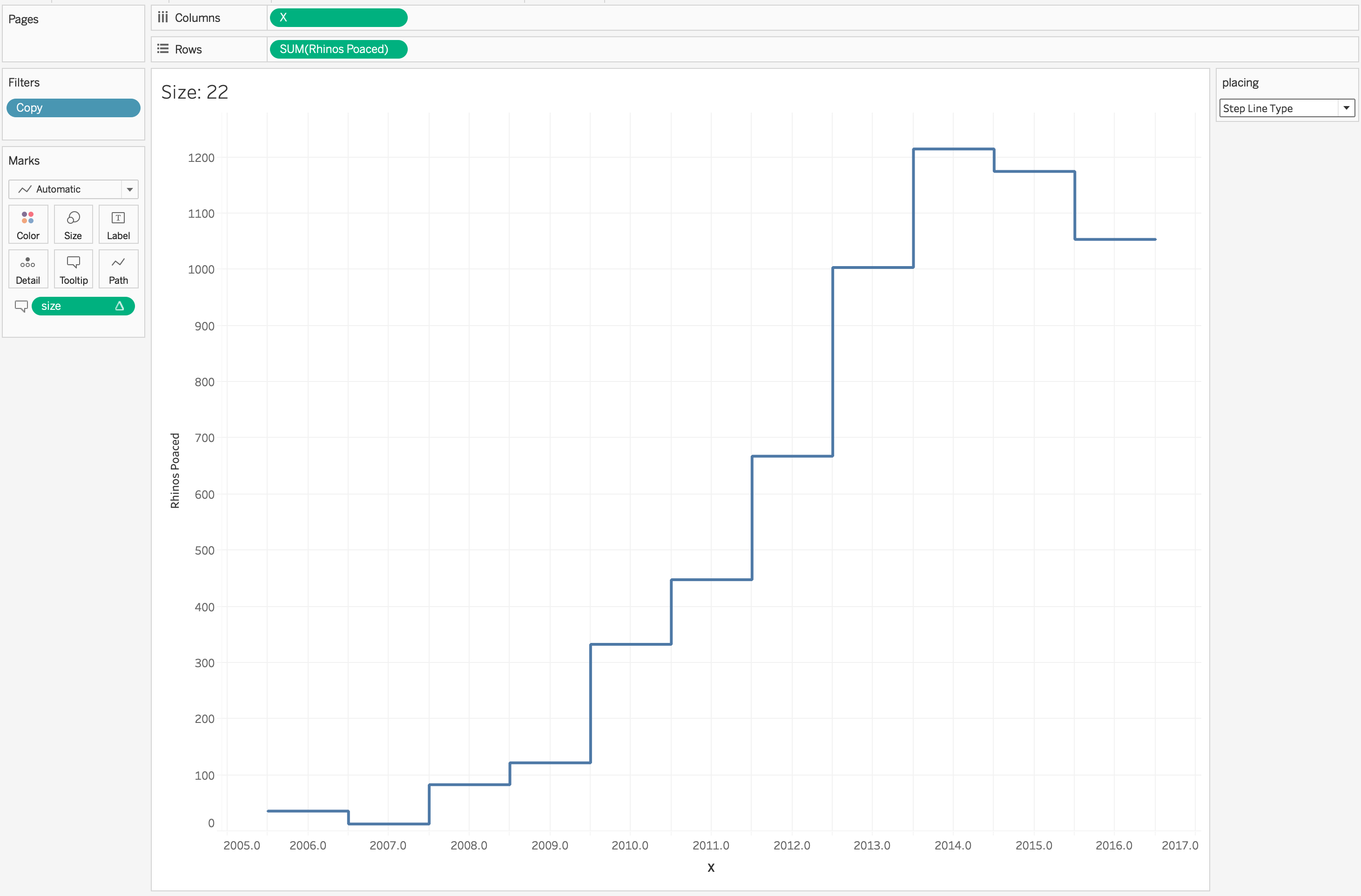

Or combining both + a little bit of formatting:
5. Final Dashboard
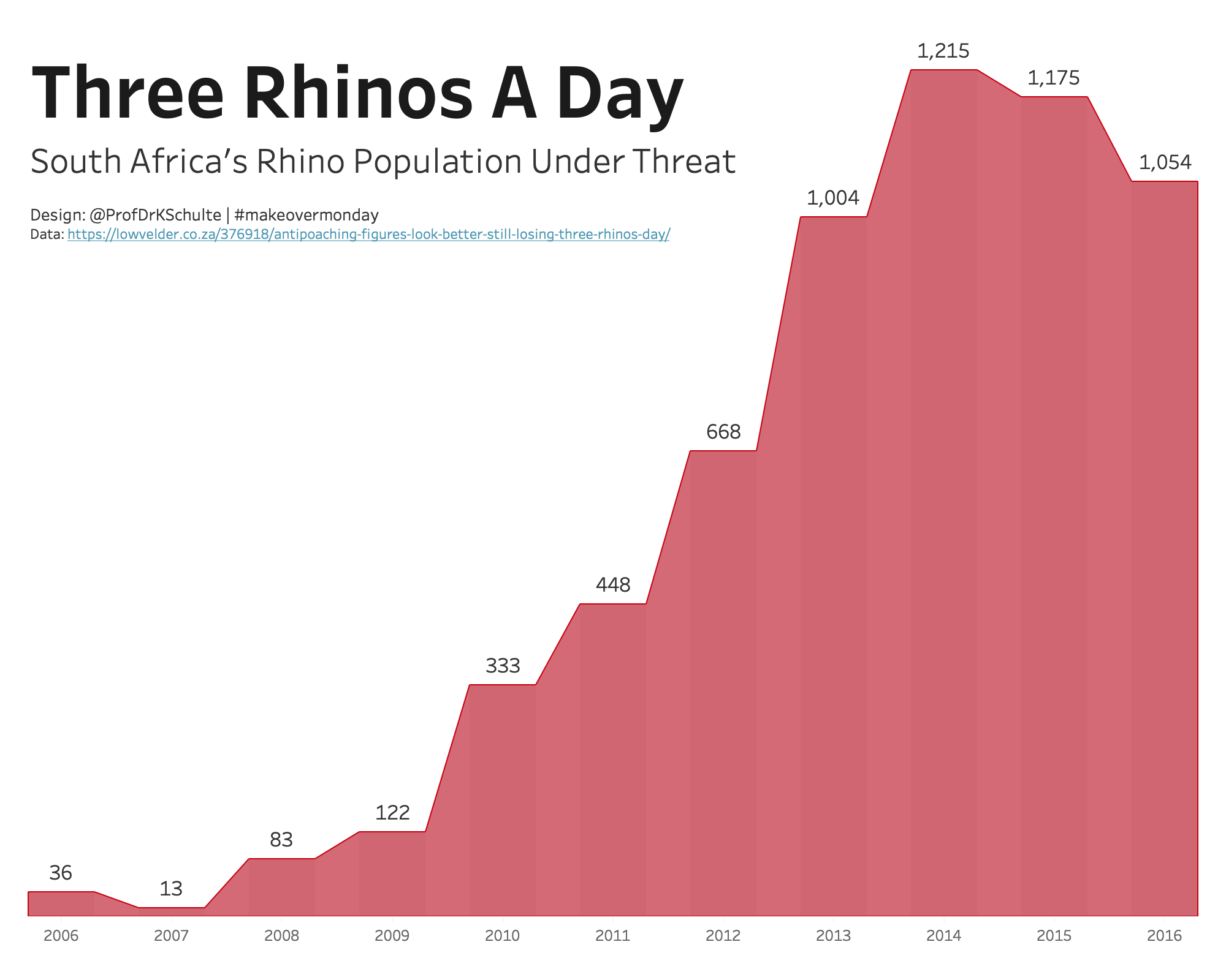
For my final dashboard I used the "A little bit stepish" parameter (click to play with the interactive version on Tableau Public) and bars behind the area to create the shadow effect. You can download the how-to workbook here.
Hope you enjoyed reading and find own use cases for this!