In the past weeks, I had the immense honor to collaborate with Steve Wexler on revisiting his famous Churn Dashboard from the Big Book of Dashboards. The #BBOD was one of the first books that came across my way when I discovered dataviz and Tableau as a topic about two years ago.
My read for the Weekend. Just arrived at our library at @FHMS_Wirtschaft @acotgreave #Tableau #dashboarding pic.twitter.com/TfJPmKo4pr
— Klaus Schulte (@ProfDrKSchulte) August 11, 2017
Steve already published a blog about our collaboration and you can also explore the revisited Churn Dashboard on Tableau Public. We discussed a lot of different approaches to combine a waterfall with a line chart. Steve's preferred solution, which he describes in the blog post, combines Gantt bars with a jump line chart.
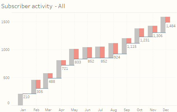
As Steve points out, this solution works very well for several reasons:
- The data prep is very straightforward, as is the Tableau rendering with easy calculations.
- It should be very easy for others to apply to their own work.
- Furthermore, you can use the date axis and you do not need an additional date header.
However, there are a few use cases, where a different approach is needed:
- Your own (or someone else's) "inner Monk" notices the slightly different gaps between the grouped bars, which is due to the different number of days for each month (e. g. February=28 days, March=31 days).
- Like Steve described, all the Gantt approaches require a little bit of “move the slider to the right until it looks right”. So, this does only look right for a fixed dashboard size. In case you use automatic sizing or the device designer for your mobile layouts, your bars and lines won't be aligned perfectly anymore in most cases.
For these use cases, I suggest using a polygon approach, which I describe below.
The POLYGON Approach
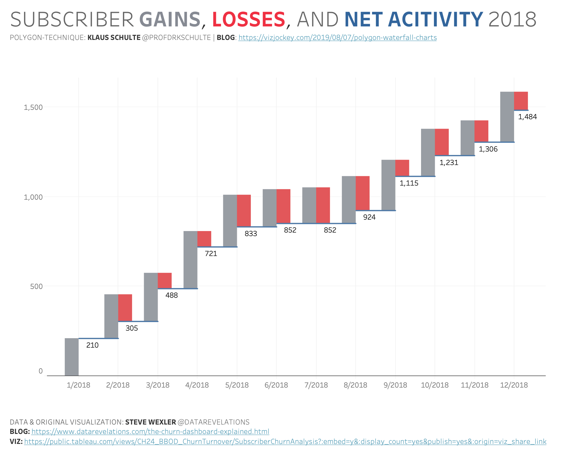
click to play with the interactive version on Tableau Public
This technique uses the polygon mark instead of the Gantt mark. And it includes a parameter you can use to set the bar size that fits best to your design:
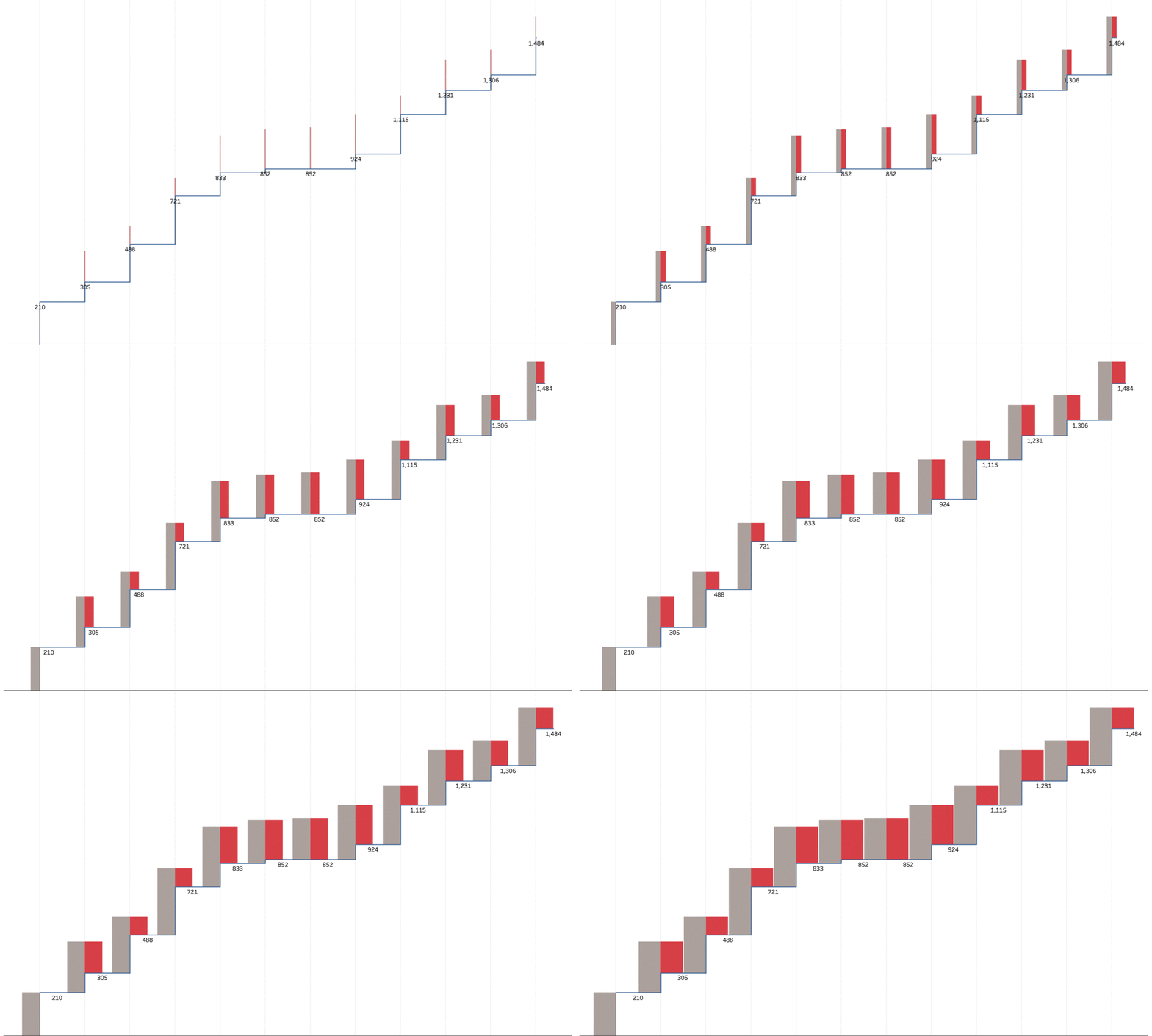
The post will guide you through the steps to create this chart.
Where to set the marks?
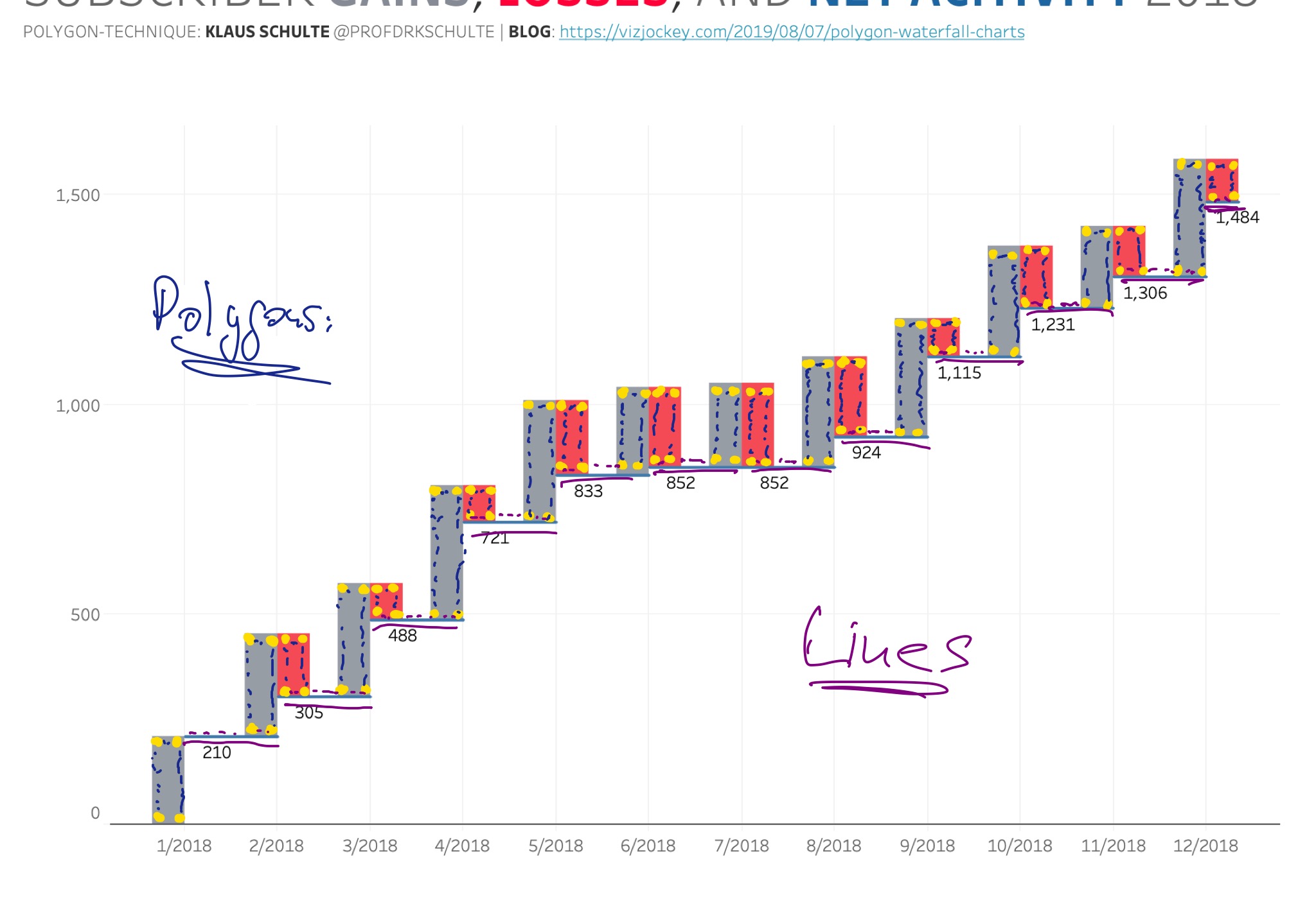
For my polygon waterfall, I need four marks for each bar and a point order to connect the marks. For the jump lines I'm using the two bottom marks from each bar.
This requires a little bit of data prep first.
Data Prep
While I'm able to plot several points on rows using measure values, I cannot do this for columns at the same time, because you can use Measure Value only once. Therefore, I have to bring in a second copy of the data, resulting in a new dimension [Table Name] with "unpivotet" for the first copy and "unpivotet1" for the second copy.
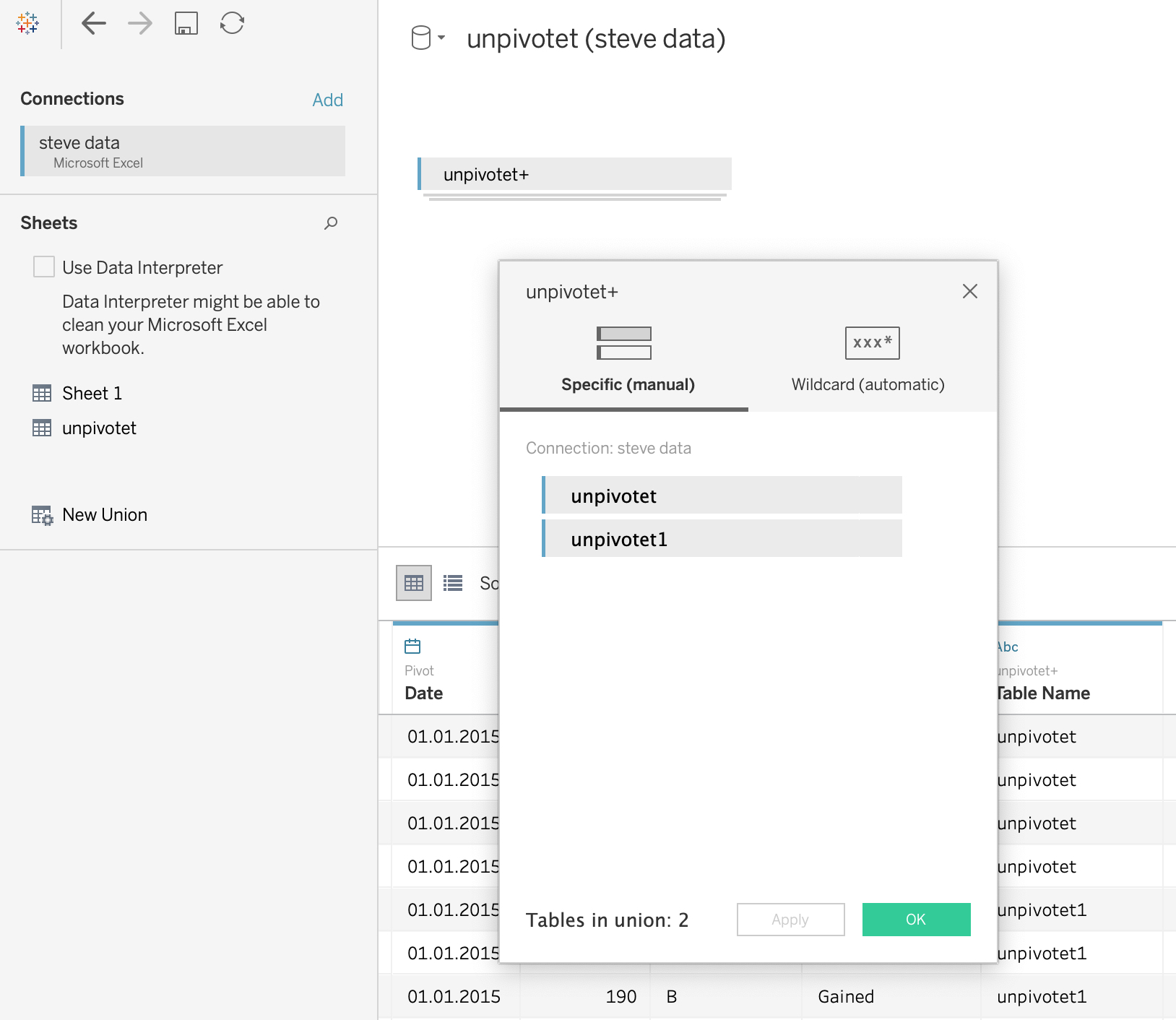
My Date/X-Axis
For my date axis, I'm using my two different kind of bars [Description] for my two left side polygon marks ([Table Name]="unpivotet") and my two right side polygon marks ([Table Name]="unpivotet1") for each month.
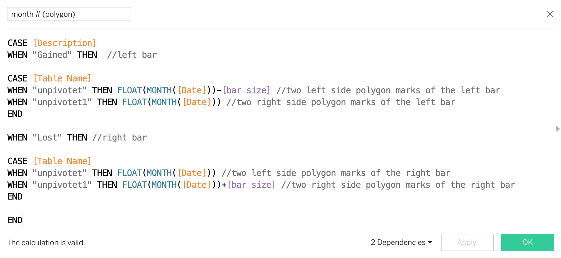
is a parameter to set the width of the bars.
This produces 48 marks on my x-axis, four for each month.
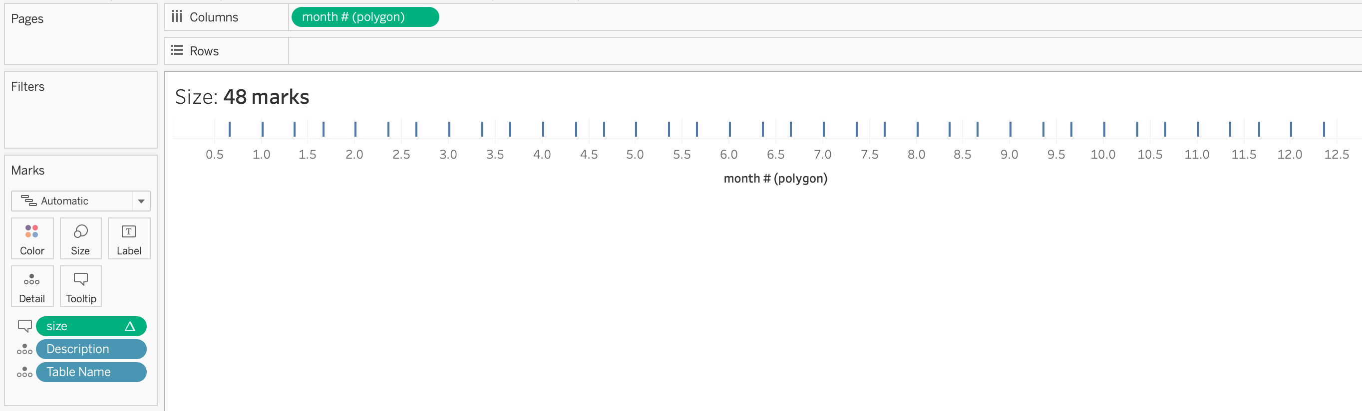
My Y-Axis
There is a measure [Amount] in the original data for gained and lost subscribers by month. Based on this measure, I calculate the running sum along my dates [Running Sum (Amount)] and the previous value [Lookup Running Sum (Amount)] in a first step:
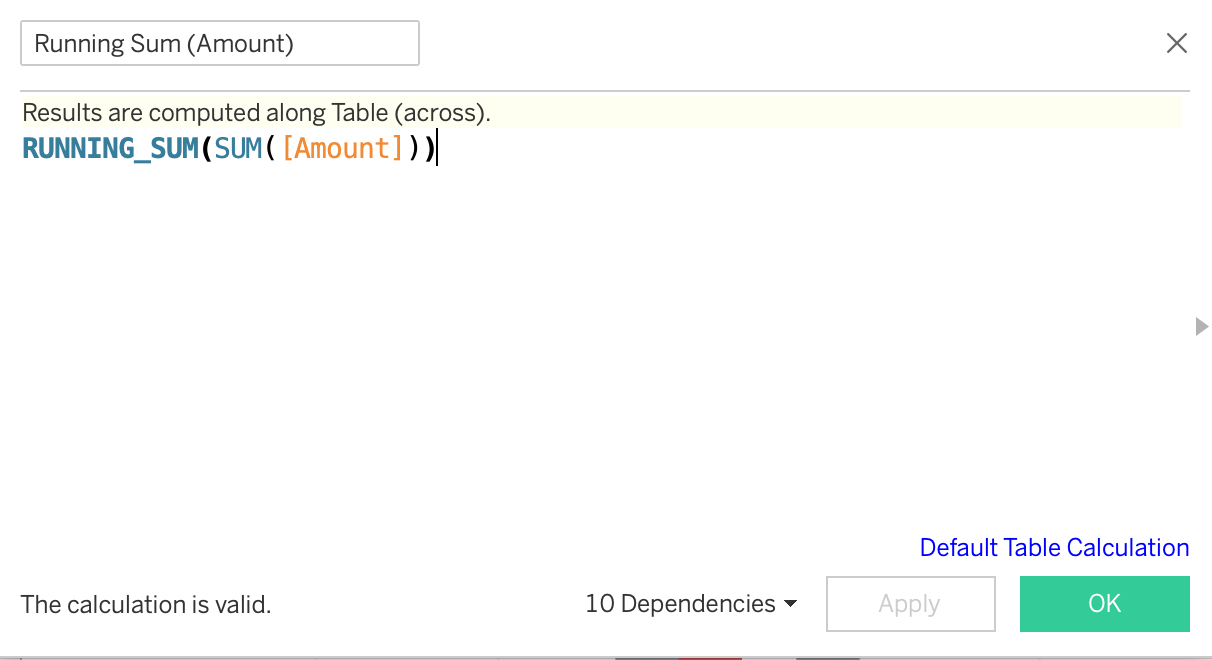
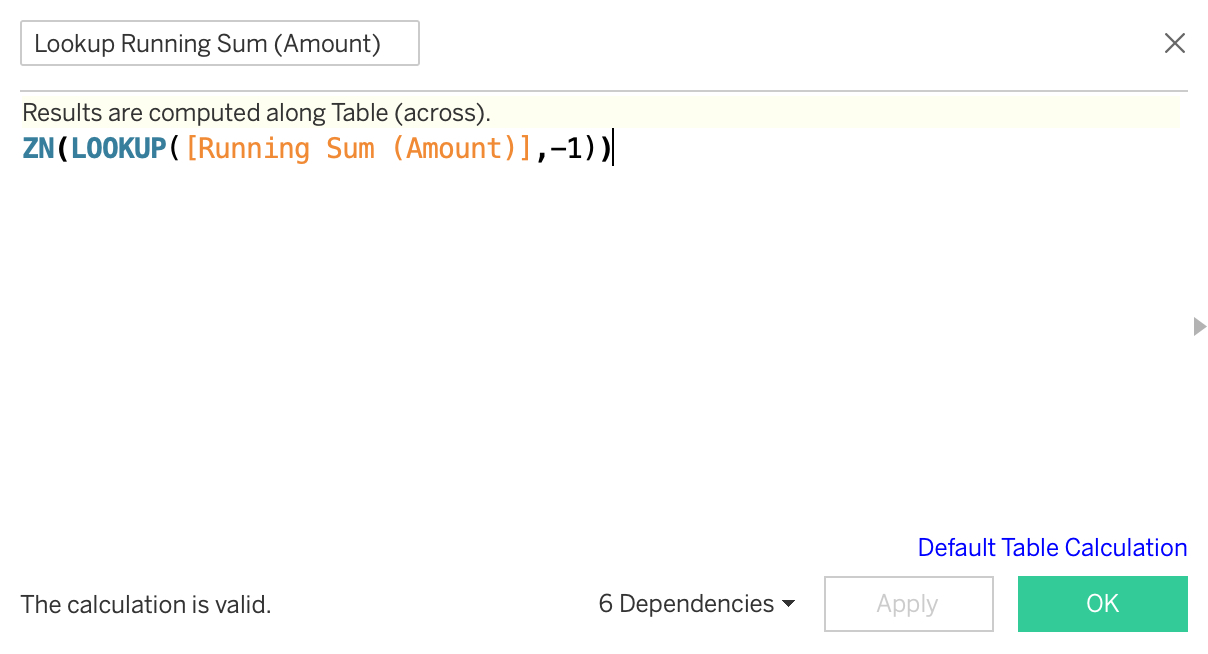
As already stated, I'm using Measure Values on rows for my polygons using the following two fields to calculate my four values for each bar.
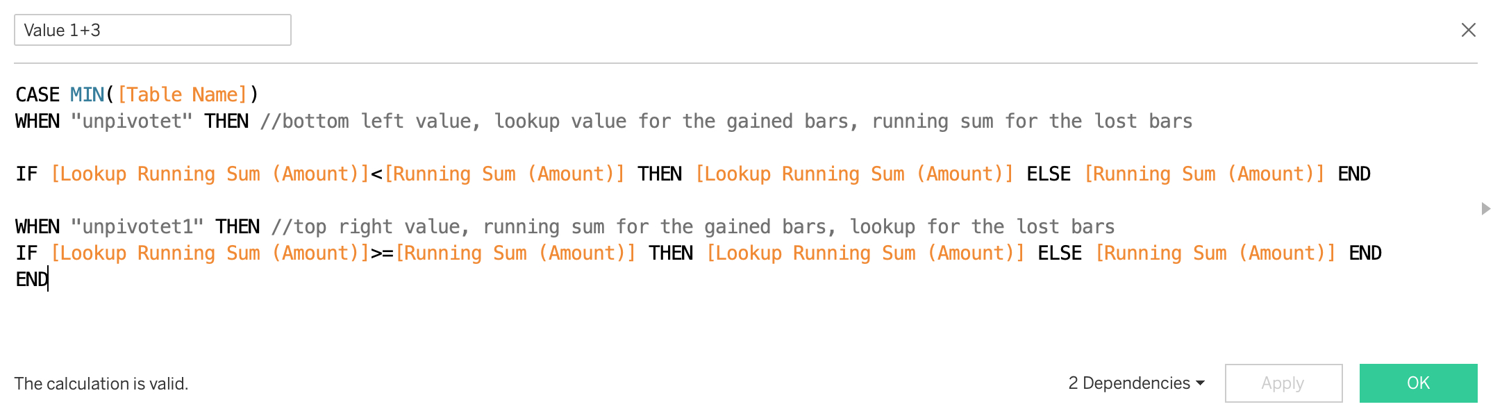
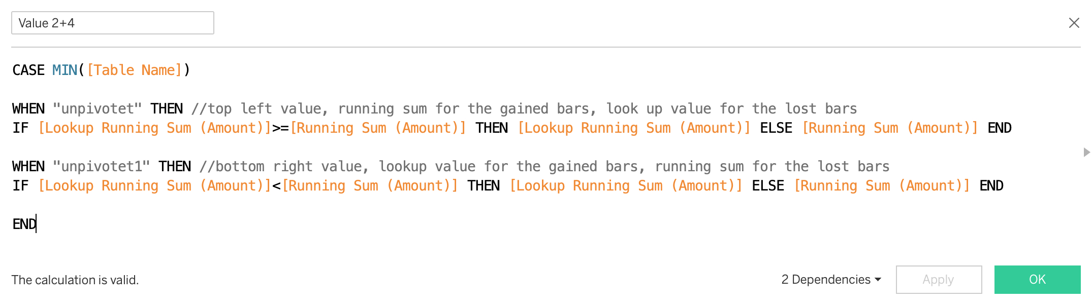
Values 1+2 are calculated with the first copy of the data ("unpivotet") and values 3+4 with the second copy ("unpivotet1"). And each value can either be the running sum [Running Sum (Amount)] or the previous running sum [Lookup Running Sum (Amount)].

This is giving me my 96 marks, 8 for every month. (I chose the circle mark here to demonstrate this.)
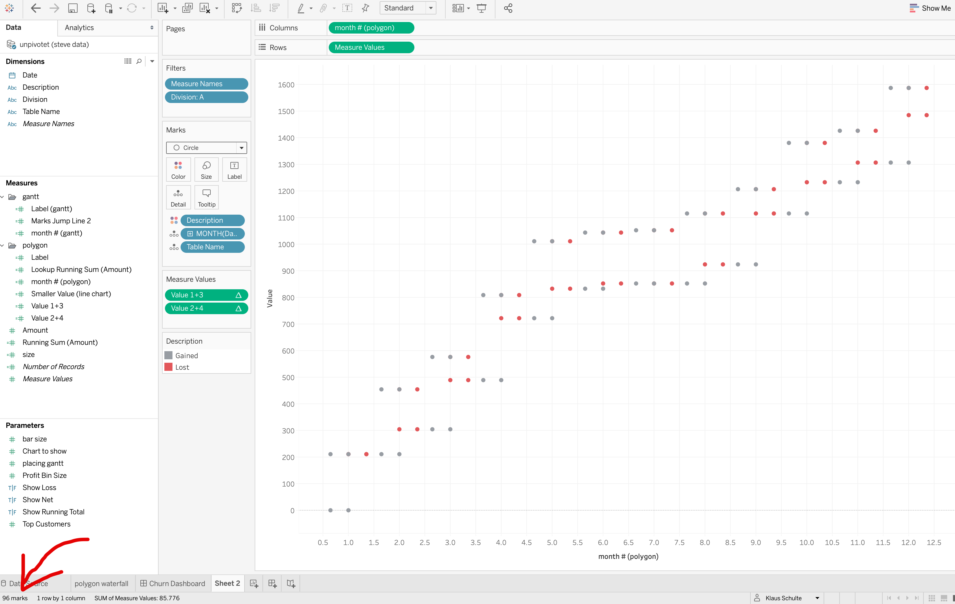
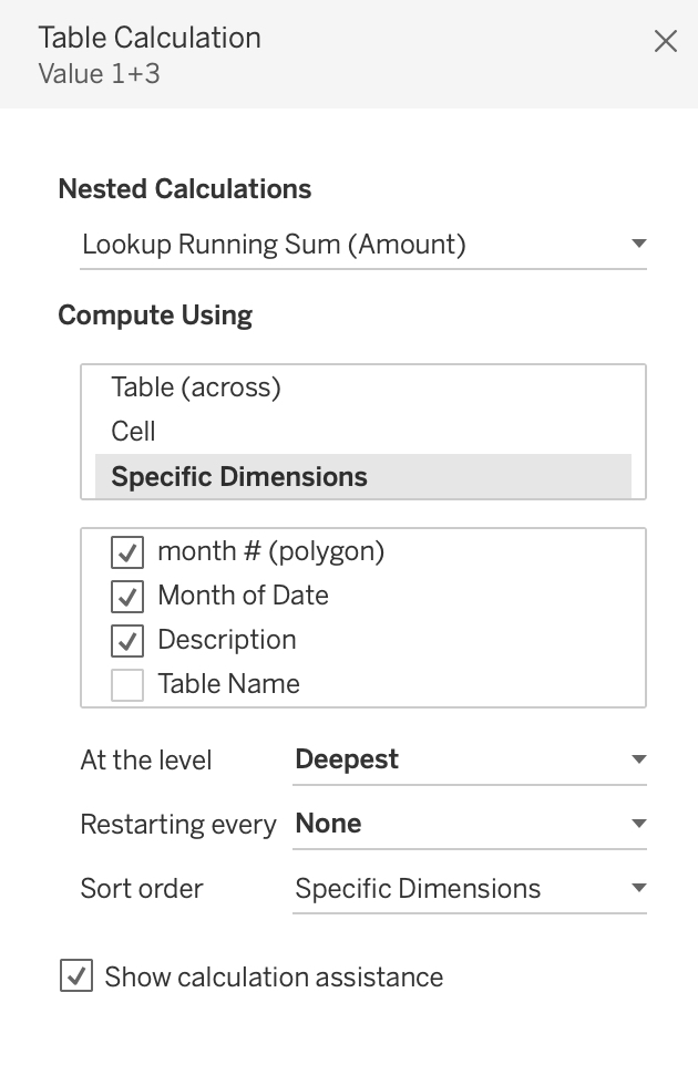
For both my measures (Value 1+3 and Value 2+4), both nested table calculations have to be computed along month # (polygon), Month of Date, Description for each Table Name.
Switching the mark type to polygon and defining the path by using my measure from the x-axis produces my waterfall chart:
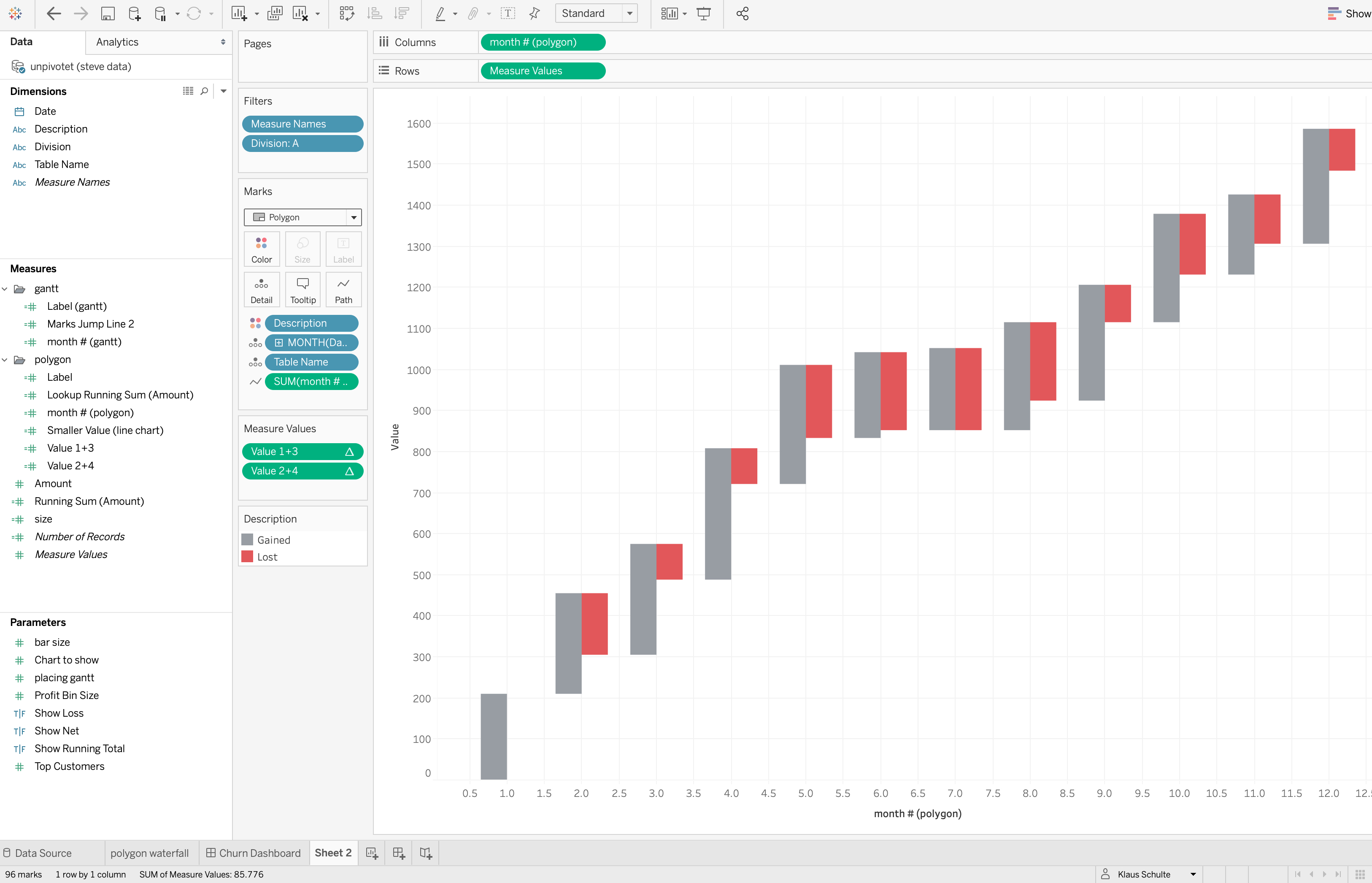
How nice!
The Jump Line
Like Steve did in the GANTT approach, I'm connecting the waterfall bars by using a jump line.
Therefore, I'm calculating the bottom values in a separate calculated field.
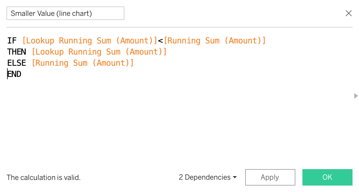
We need to make sure to compute the table calculations like shown in the screenshot:
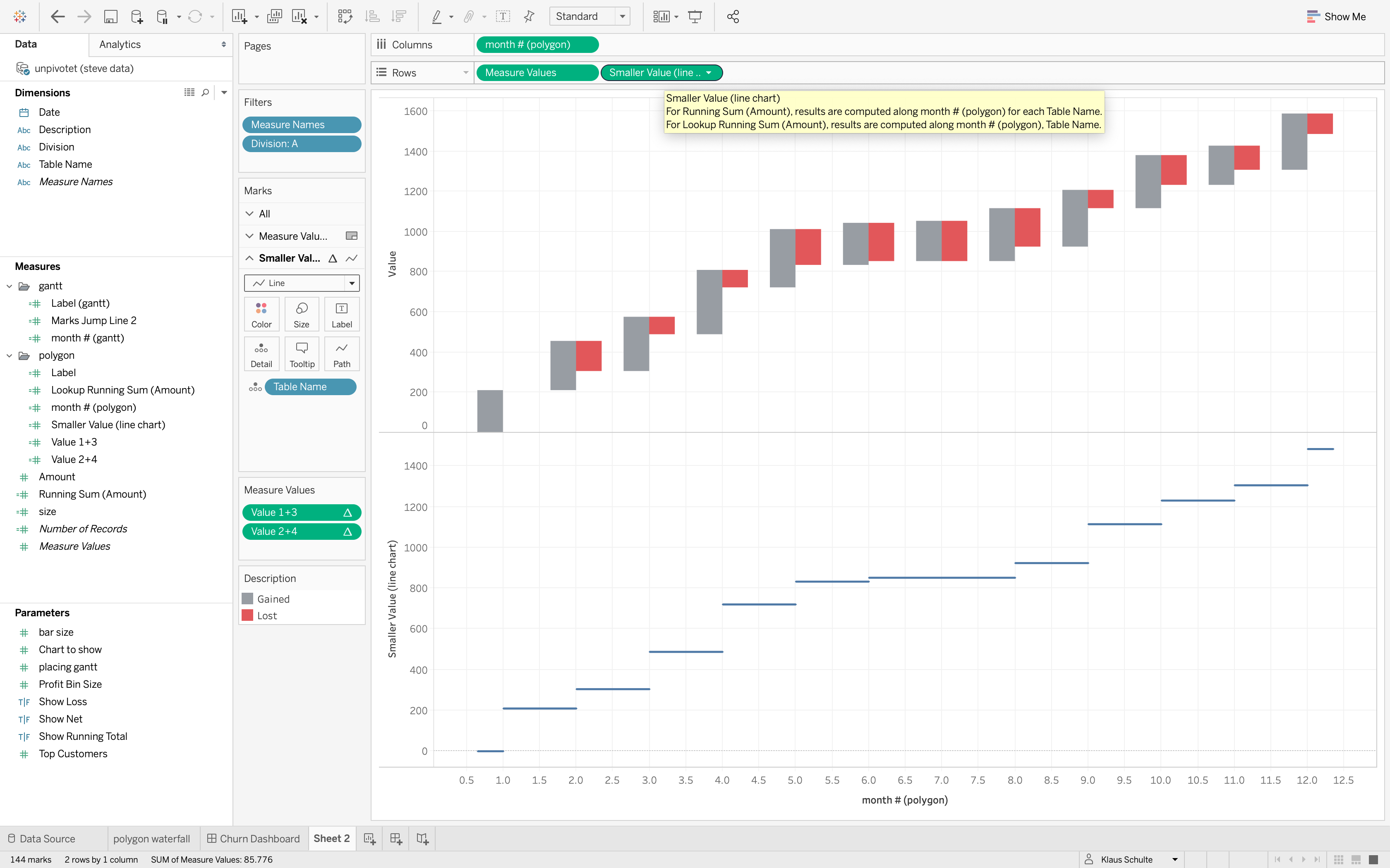
Bringing it together
In the last step, I'm creating a dual axis and labeling the line chart at the bottom right ("unpivotet1") of the "Lost"-marks:

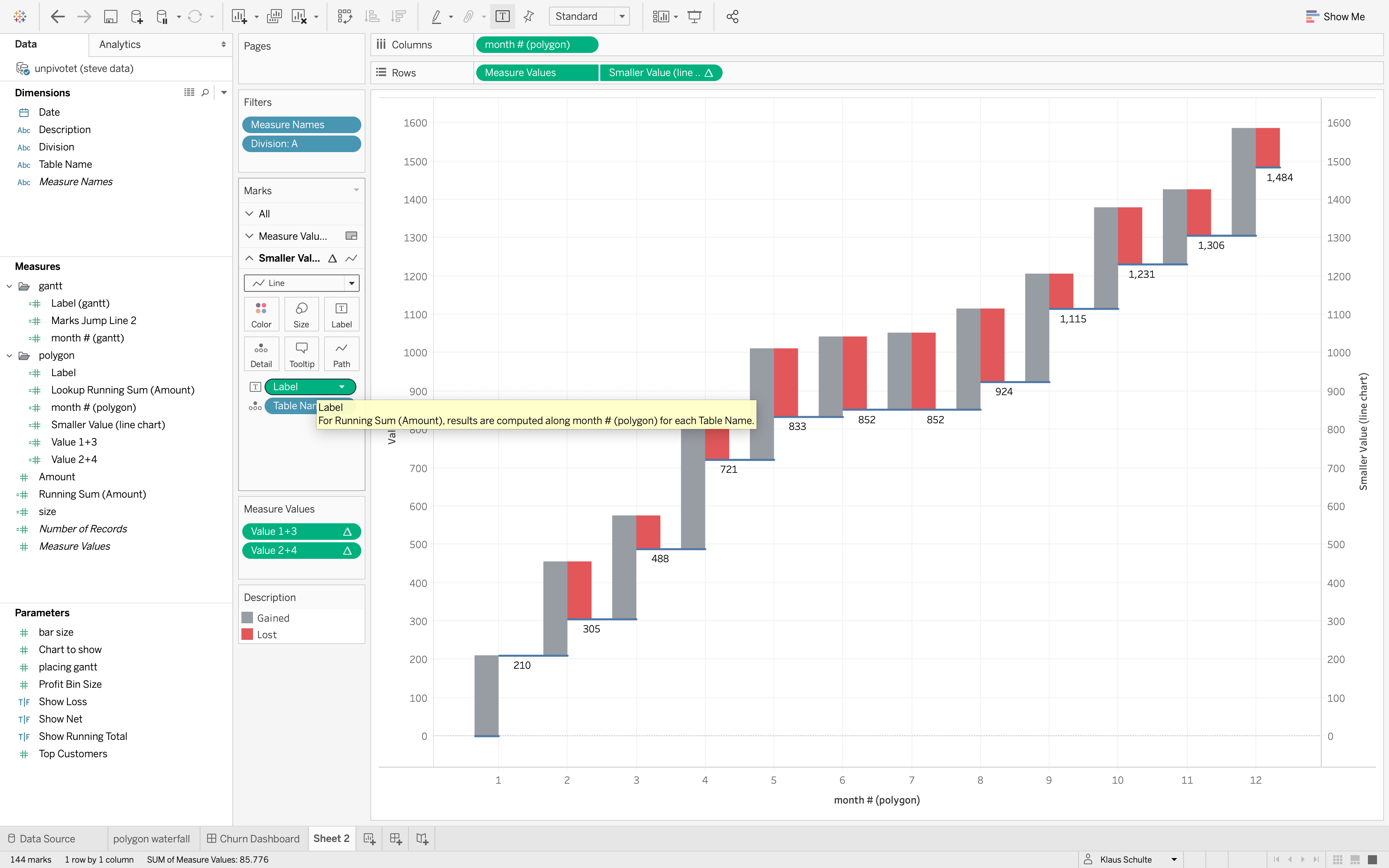
That's it!
Wrap Up
I admit, this is advanced stuff, but there might be some good use cases for this, like mentioned above.
Let's for example have a look at the automatically generated mobile layouts:
Tablet
![Tableau - blog polygon waterfall [from PUBLIC.TABLEAU.COM (DEFAULT)] 2019-08-07 20-55-25.jpg](../images/wp-content__uploads__2019__08__Tableau-blog-polygon-waterfall-from-PUBLIC.TABLEAU.COM-DEFAULT-2019-08-07-20-55-25.jpg)
Phone
![Tableau - blog polygon waterfall [from PUBLIC.TABLEAU.COM (DEFAULT)] 2019-08-07 20-56-36.jpg](../images/wp-content__uploads__2019__08__Tableau-blog-polygon-waterfall-from-PUBLIC.TABLEAU.COM-DEFAULT-2019-08-07-20-56-36.jpg)
The waterfall chart itself works without further ado, I would only get rid of the labels in the phone layout.
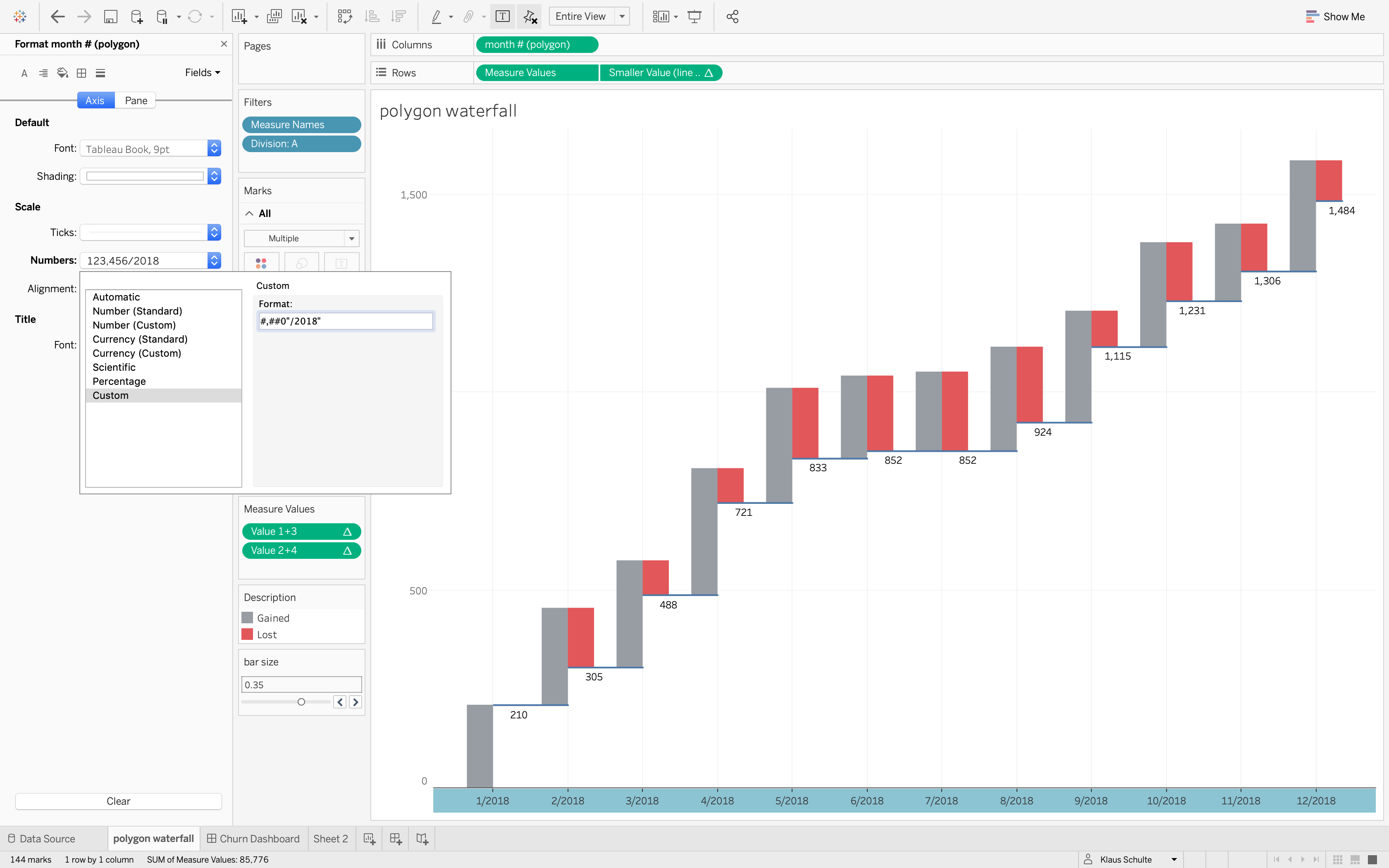
The one obvious disadvantage - beside the need of an extra copy of the data - is, that we cannot use a date field on columns. So, normally, you would have to bring in a second sheet to show the month names.
In this case, I used a custom format for the axis, which makes the chart obviously static here. So be careful doing this!
I hope you enjoyed reading and that you'll find own use cases for both approaches, the Gantt approach and this POLYGON approach.