I've been experimenting with Viz-in-Labels lately like in my 9M Profit Bridge on Deutsche Bank's financial report data or my custom treemap on Tableau's superstore data.


https://public.tableau.com/profile/klaus.schulte#!/vizhome/CustomTreemapSuperstoreSales/CustomTreemap
Viz-in-Label (or Viz-in-Marks) is a technique to visualize more than one data relationship at once. In both visualizations above, the chosen primary chart types (waterfall and treemap) are visualizing part-to-whole. In the first example, little sparkbars show change over time, in the second example horizontal sparkbars show ranking/magnitude of sub-categories. In both examples viz-in-label give additional context to the primary chart. Unfortunately however, unlike viz-in-tooltip, there is no such functionality in the Tableau standard.
This post will guide you through the steps to create one of the examples, the custom treemap with viz-in-label.
1 Data
This example is using Tableau's superstore data. I aggregated sales on sub-category level and included category for additional context and saved this data to an excel file.
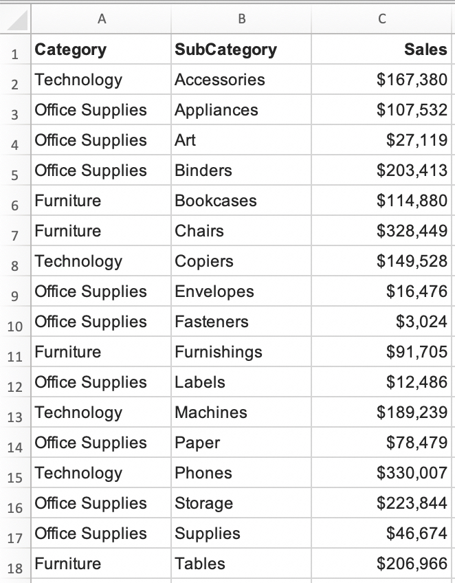
While it isn't possible in Tableau to create custom treemaps out of the box, I had to get the treemap coordinates from outside Tableau. Therefore, I uploaded the data to R and used this little script to get my coordinates:
library(ggplot2)
library(treemapify)
library(readxl)
library(writexl)

# Getting Treemap Coordinates ----

superstore <- read_excel("Superstore_data.xlsx")
superstore

treemap_coords <- treemapify(superstore, area="Sales", start = "topleft", subgroup = "Category", subgroup2 = "SubCategory")
treemap_coords

write_xlsx(treemap_coords, "treemap_coords.xlsx")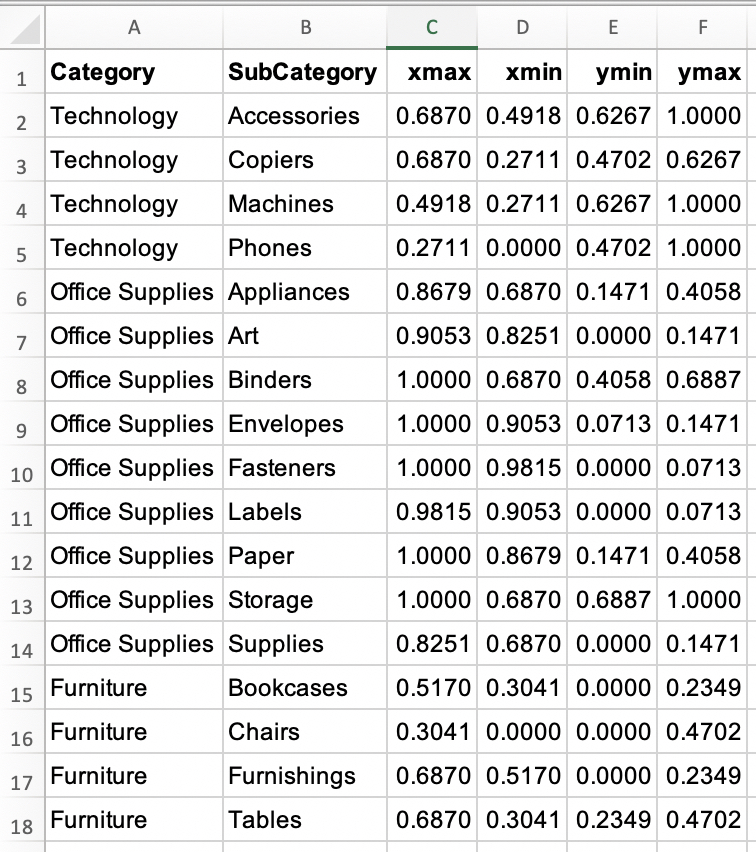
Next step was to bring my data back to Tableau and it eventually needed this data model to execute my idea. No worries, I will guide you through this model step-by-step.

2 Self Join
First step was to join the superstore data with itself.

This allowed me to create the little sparkcharts at a later step. For demonstrating purposes, this is what it looks for example like, when you bring in both Sub Categories and Sales from the second table: 17 identical charts for each Sub Category.

3 Creating the Sparkbars
To place my sparkbars, I'm using the Get-Rid-of-the-Grid technique. To do so, I had to calculate some xy-coordinates based on my treemap coordinates:

I wanted to place my sparkbars to be placed in the top left corner of each area. Therefore, I calculated the minimum x and maximum y depending on the level (Parameter "Level" 1 (Category) or 2 (Sub Category)) I wanted to display.

3.1 Y-Coordinates
Starting from Ymax I subtracted for each member of my selected level (category/sub category) a fixed height for each bar based on a parameter Height, the maximum number of possible bars which is the distinct number of sub-categories, and index of the selected level. The parameter 'PositioningY' helped me to place the charts at a later stage.

3.2 X-Coordinates
For the x-coordinates I started from my calculated Xmin and added Sales as a percentage of total (Sales_rel). I implemented a parameter Length bars to play with the length of the bars and again a parameter 'PositioningX' to place the charts at a later stage.

3.3 Building the View
I wanted to have the view switchable between Category and Sub Category level, thus I first created two dimensions Level 1 and Level 2:


After bringing these two fields on detail, x on columns, and y on rows, I just had to set my index-table calculation accordingly to get a first result:

Then sorting the Level 2 dimension based on Sales in descending order and we're almost there.

For a first interim result (we have to get rid of this step again at a later stage) I'm creating a combined axis with a second x (spark) to define the 0-positions for the sparkbars.

Adding a boolean calculation to color the bars, ...

...changing the mark to lines. and putting measure names on detail gives us this for sub categories...

...and this for categories.

Nice!
4 Creating the Treemap
4.1 Data and Calc
First step to create the treemap is to densify the data. I therefore created this simple model data set and built the Cartesian product with the data already in.
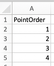

In addition to Xmin and Ymax which were already calculated in step 3 I also needed to calculate Xmax and Ymin the same way.
Then x (tree) and y (tree) could be calculated with simple CASE statements.


4.2 Creating the View
With x on columns, y on rows, Level 1 on details, PointOrder on path, and selecting the polygon mark, putting together the view is pretty straight forward.


5 Bringing everything together
5.1 Data and Calcs
For bringing everything together, I brought in a second model called layer...
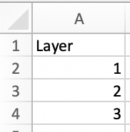
...and again joined this data with the already existing data.

(To sum it up: at this point we have 17 (from the self-join) x 4 (from the treemap model) x 3 (from the layer model) = 204 copies of the data in.)
Based on these three layers I could define my joint X:

I also had to define my sparkchart Y for Layer 1 & 3, but not for the treemap Y, because sparkbars and treemap are using separate axes.

5.2 Creating the View
The views can now be created like shown before.
For the treemap:

And for the sparkbars:

Creating a dual axis and we are there:

6 Summary
From this point, everything else is just doing the formatting and placing everything with the parameters. I used the 0-position of my first "bars" for the labelling, therefore I had to calculate some additional fields. And I also hid the sparkbars for the smallest areas based on a parameter. You can find in in the workbook on Tableau Public.
Thanks for reading, please reach out to me for further questions here in the comments or on Twitter (@ProfDrKSchulte).